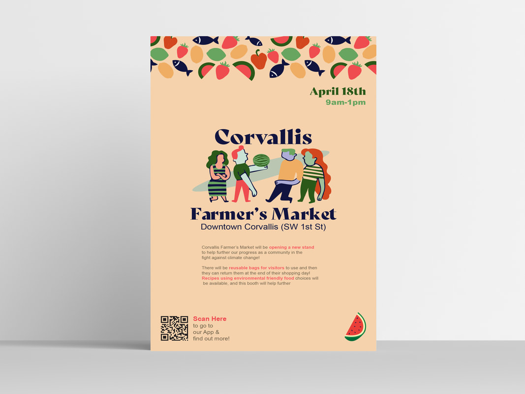
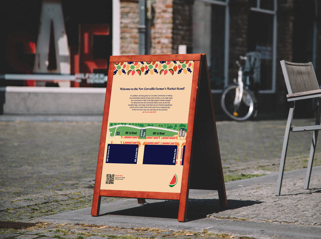
Corvallis Farmers' Market
This was a collaborative project with a focus on sustainability and creating a healthier environment in our community of Corvallis,Oregon. One important aspect of this project was we wanted to encourage the community to make sustainable choices by rebranding the Corvallis Farmer's Market, and create new posters to help promote the weekly event to the community. Together as a group, we decided to create posters that would be printed using recycled paper, and create digital versions to also be accessed through a website for the market. We chose to use unrealistic colors for skin tones and hair colors, so that everyone felt represented in the poster, and it further expressed the message that the Farmers' Market is for everyone in the community, not just a select group. We also wanted highlight some of the sustainable food choices available at the market through the border.
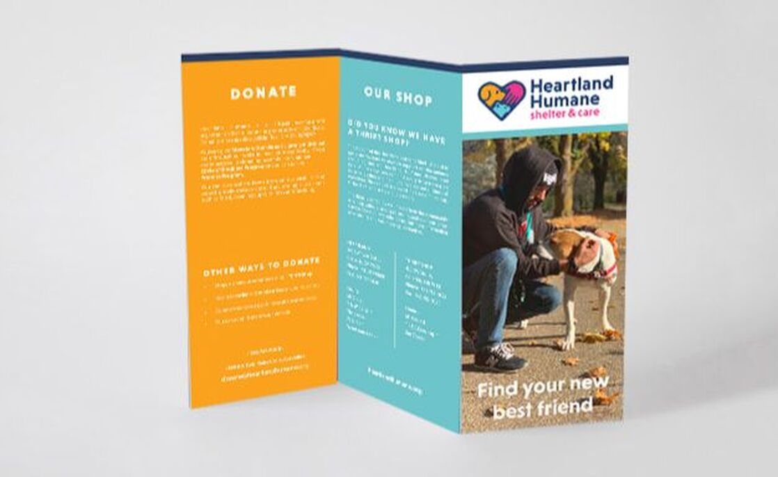
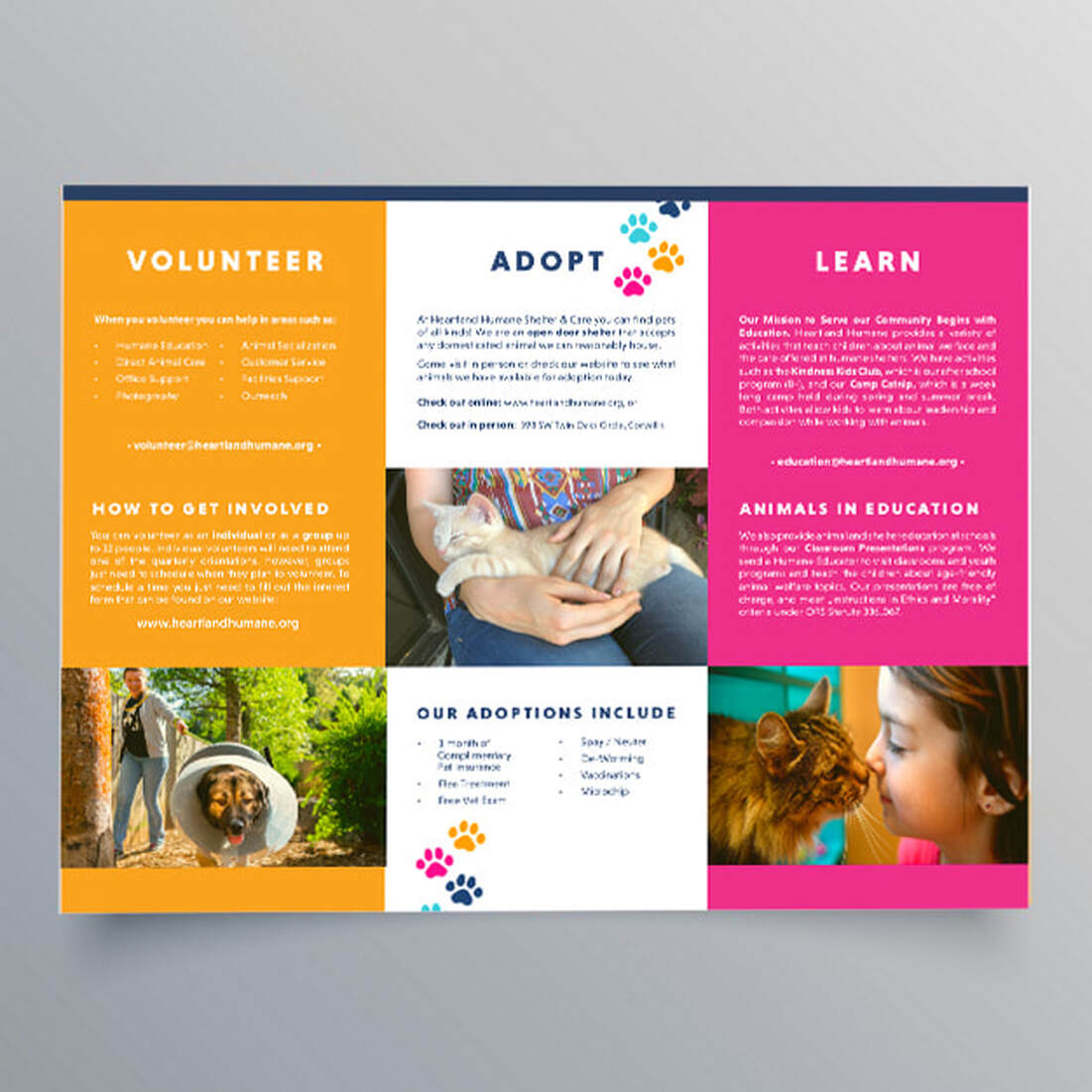
Heartland Humane Shelter & Care
This was a collaborative project, where we worked with the animal shelter, Heartland Humane Shelter and Care in Corvallis, Oregon, to apply a new design system that was created during their re-brand and apply it to media. My design team was responsible for re-designing their website, social media ads, business card, and brochure. While working on this project with my team, I was responsible for designing the brochure so that the information was easy to read and condensed the information into one brochure rather than four. While applying the branding system we made sure all deliverables communicated that the shelter is a fun place and they all work hard to find every animal a loving home in the community,
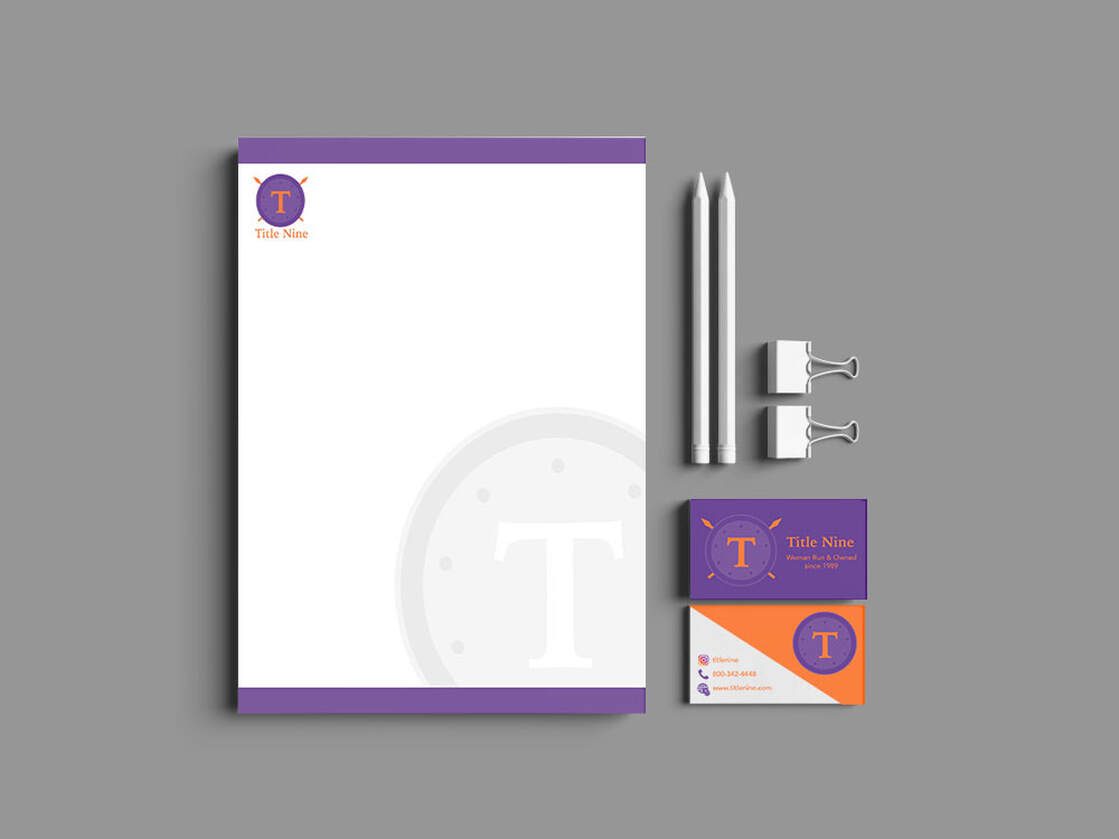
Title Nine Logo
This is a re-brand project, in which I chose to design a new branding system and logo for the women's athletic store, Title Nine. I wanted to create a branding system that made customers fell bold and powerful while straying away from stereotypical gender colors. The logo is a greek shield to connect to the idea of the powerful greek Goddess Athena and communicate that Title Nine clothing is armor for active women. The nine circles on the shield represent the community that Title Nine creates with their team and customers. I then applied the new branding system to multiple deliverables such as, tags, shopping bags, hats, masks, and stationary.
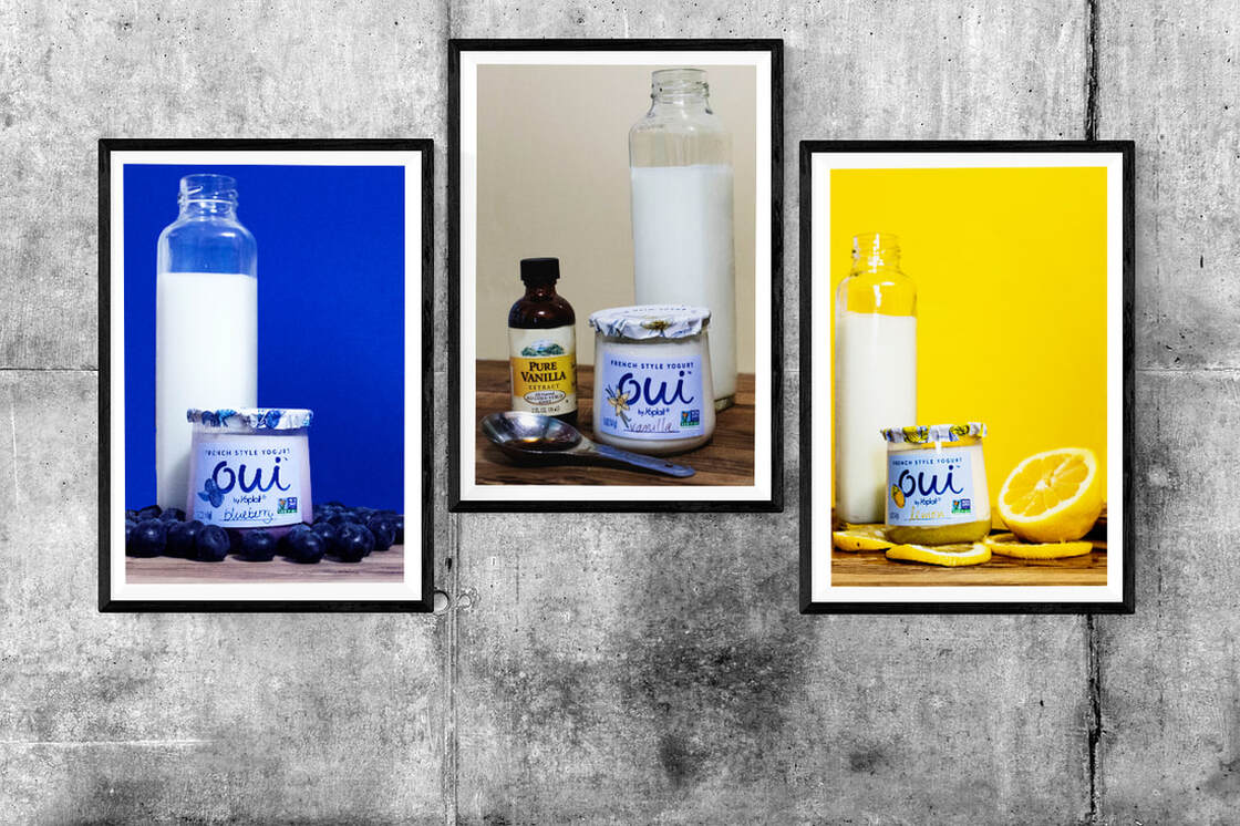
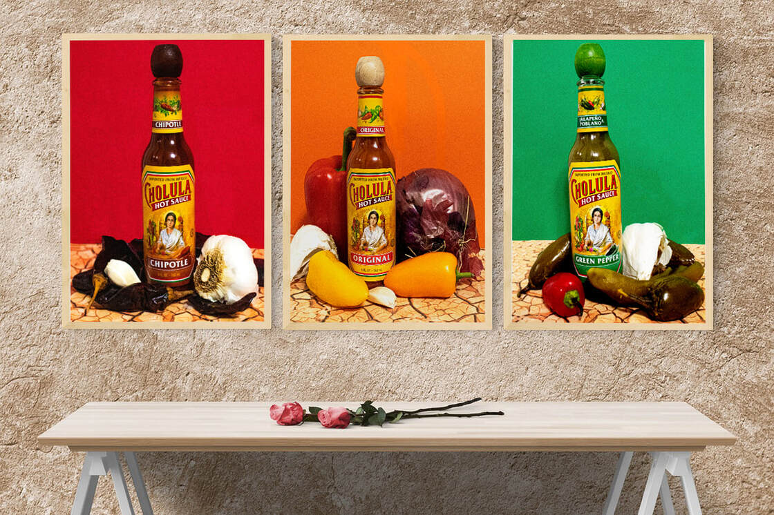
Product Photography
This project showcases my studio lighting skills. For this project, I was two choose three flavors from two separate products and create a set that communicates the flavor profile and feeling that people get when experiencing the products. For OUI Yogurt, I chose to highlight the flavors: lemon, blueberry, and vanilla, and communicated the flavors through the colors and showing the ingredients around the product. I also chose to set the products on a cutting board with the ingredients to communicate that it is almost like it's homemade.
For the Cholula Hot Sauce, I chose to highlight the flavors: original, green pepper, and chipotle. I communicated the flavors by placing the ingredients around the product, and expressed the varying levels of hotness through the background colors. Mild= green, medium=orange, red=hot. Lastly I wanted the photos to communicate that the sauce is so hot feels like you are right in the desert, which is why I chose the desert ground for the base of the image. This project not only tested my lighting skills, but my editing, and set creation skills as well.
For the Cholula Hot Sauce, I chose to highlight the flavors: original, green pepper, and chipotle. I communicated the flavors by placing the ingredients around the product, and expressed the varying levels of hotness through the background colors. Mild= green, medium=orange, red=hot. Lastly I wanted the photos to communicate that the sauce is so hot feels like you are right in the desert, which is why I chose the desert ground for the base of the image. This project not only tested my lighting skills, but my editing, and set creation skills as well.
Holistic Health Clinic Content Design
While working at Holistic Health Clinic as a Social Media Manager, I oversaw all the content being put on our social media platforms and website to ensure that the content communicated the Holistic and community values at the clinic. I also worked closely with a team of content creator and website editors to grow the visitation to both our website and social media to bring the clinic more business. This job allowed me to learn to manage a team-members and ensure the outcome of the project was seen through.
Core App Design
Core is an app I created conceptually with a team of designers. It os targeted towards students and helps them keep track of their assignments and educational lives. The app comes with a calendar of upcoming assignments, a timer that tracks their time it takes to complete an assignment, and a chart that logs information on how long it takes them to work, so that the app will know how much time they need to dedicate for certain work, and make it easier for people to track all their assignments and prevent them from getting distracted or turning work in late. Students would also have the option to connect their canvas to the app so it automatically loads their assignments instead of having to manually enter them into the app.
After creating the concept, I worked independently to design the logo, theme, and the overall look of the app. I chose to use warm colors to go off the idea of a planet's core, as the app is the core of a student's life. I ensured the app was easy to navigate and had a simple layout to provide an easy user experience. Below you can watch a video that guides you through the app. While I designed most of the screens, the app isn't functioning, as this was a purely conceptual project, and only created screen layouts instead of programming the app to function.
After creating the concept, I worked independently to design the logo, theme, and the overall look of the app. I chose to use warm colors to go off the idea of a planet's core, as the app is the core of a student's life. I ensured the app was easy to navigate and had a simple layout to provide an easy user experience. Below you can watch a video that guides you through the app. While I designed most of the screens, the app isn't functioning, as this was a purely conceptual project, and only created screen layouts instead of programming the app to function.
Fashion Editorial
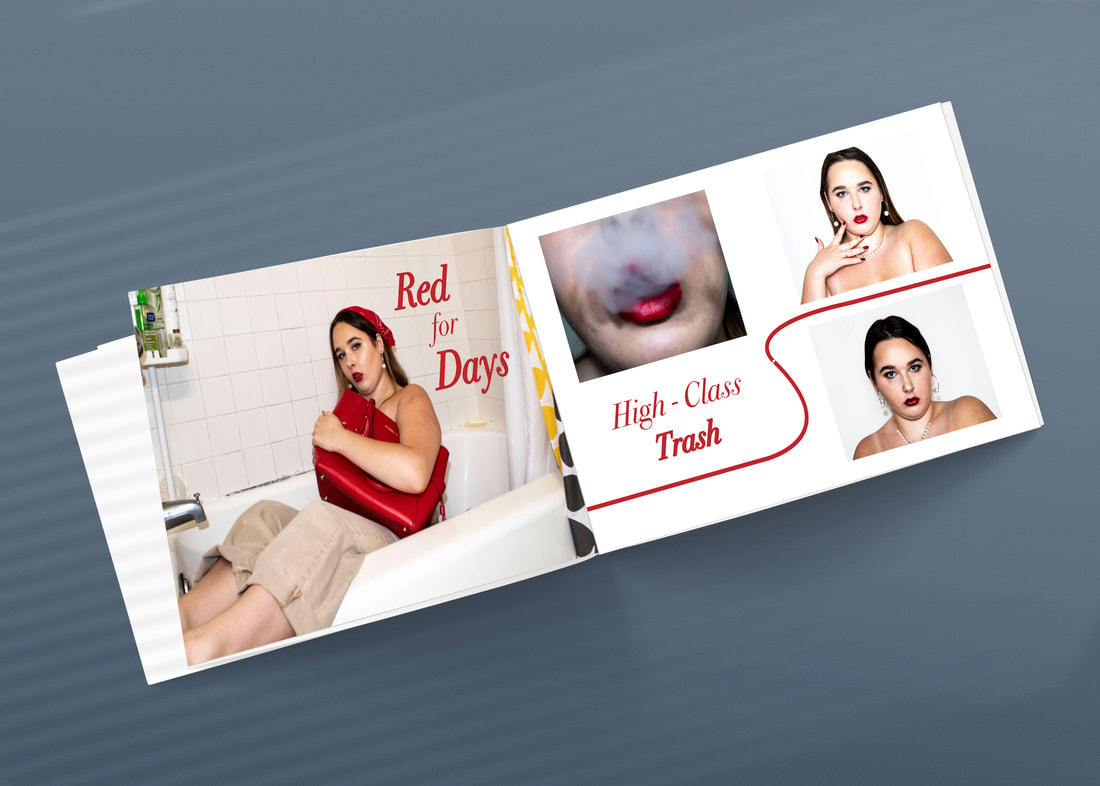
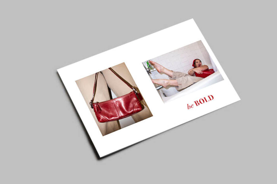
This project showcases my skills in studio lighting, photography, editing, creative directing, and design. I was instructed to create an 8-page fashion editorial that follows a theme while showcasing different accessories/clothes. For my editorial I wanted to show classy fashion, but look at it from the lense of someone in middle class, and make fun of the upper class by clashing the classy items with a messy theme. I also highlighted mild nudity throughout the shoot to challenge myself and play into the messy but classy narrative. I also chose to carry the color red throughout the whole book to help create a cohesive feel for the entire editorial.